The Best Datapoint of All: Steel
If you're after a genuinely mind-shifting way of looking at the state of the world, consider the amount of metal we have in our lives
Sarah O’Connor has a great op-ed in this morning’s FT saying we need to be spending less time obsessing over conventional measures of economic development like gross domestic product (GDP) per capita and more time thinking about alternatives.
The one she particularly favours is life expectancy - and you can see why. While the US excels in terms of GDP per capita it’s way behind much of the rest of the G7 when it comes to life expectancy. Also unlike GDP, life expectancy statistics don’t have to be adjusted for stuff like exchange rates and purchasing power which is definitely a good thing.
The quest for a useful alternative for GDP has been going on pretty much since GDP was invented, and will continue long into the future. But may I mention one very useful comparative statistics which Sarah doesn’t - and which isn’t, as far as I know, mentioned in any of the mainstream dashboards of development and progress. That metric is steel per capita.
My contention - and yes to some extent I’m talking my book here but hear me out - is that looking at the amount of steel that exists in a given society gives you just as good (in some cases even better) an insight into that country’s level of progress. And happily, using this metric is far more intuitive (and less prone to things like purchasing power parity adjustments) than things like GDP per head.
The key thing to remember here is that there is steel everywhere. Your car has perhaps a tonne of steel in it. Your house is almost certainly held up with steel. The machines in your kitchen are made and encased in steel. When you travel in the subway, you are travelling in a steel tube along steel rails, using steel escalators and elevators to get up and down from the platform.

To put it another way, the more infrastructure you have in your country - the more cars and trains and hospitals and schools - the more steel you have in your country. Therefore, counting how much steel there is in use (which is something we can at least estimate since quite a lot of data exists on this) and dividing it by the number of people in the country should, in theory at least, give you a pretty good sense of how developed that country is.
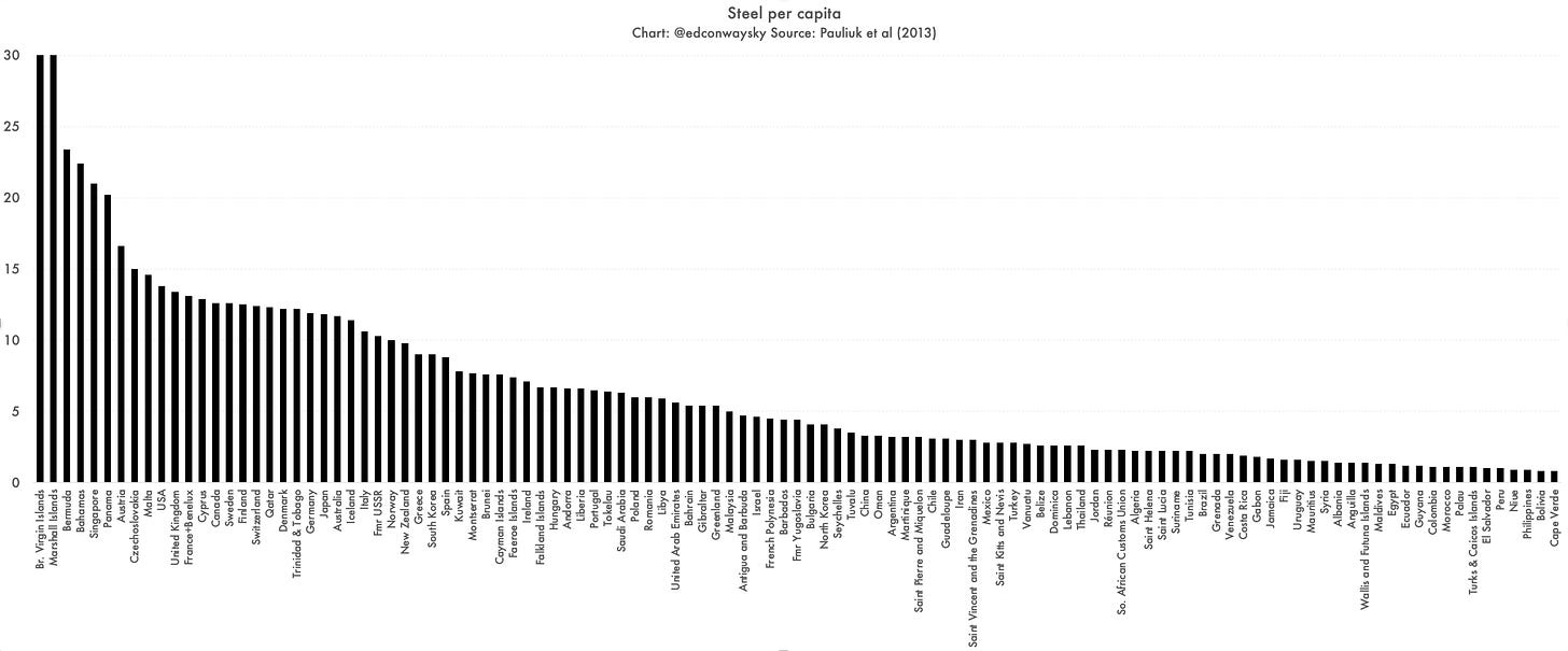
And guess what: that’s precisely what you find. I’ve taken the data on this from the best paper on the topic from a few years ago by Pauliuk et al and there are some pretty clear takeaways.
Most developed economies - places like the UK, the US, Japan and most of Europe - have around 10–15 tonnes of steel per capita. In the UK it’s 13.4 tonnes. In the US it’s 13.8 tonnes; in Germany it’s 11.9 tonnes.
Think about it for a second: that’s the steel in your car (or cars), in your home, in your washing machine and your local hospital and schools. The steel is a pretty strong signifier of development. The more stuff we have, the more steel we have. After all, as the old adage goes, if it’s not made of steel it’s made with steel.
Now look at middle income countries like China. According to this analysis they have around 3–5 tonnes per capita of steel. The numbers from Pauliuk are slightly out of date here - the paper dates from 2013 and their dataset from 2008 - so I suspect China is a fair bit higher now, perhaps closer to 7 tonnes or so per capita. But even so, you get the idea: less steel per capita. Less stuff per capita.
Now look at Sub-Saharan Africa and you see steel stocks are mostly below a tonne per capita. In the case of places like Mali and Niger it’s barely 0.1 tonnes per capita. This, to me, is a far more visceral way of explaining development and the gaps between nations than GDP.
Look! These countries simply don’t have as many hospitals and cars and devices and schools and trains as their western counterparts. They don’t have as much steel embodied in the veins of their economy.
Now, there are some quirks in the data. Countries with small populations concentrated into cities tend to be very high up on the rankings. So the British Virgin Islands and Marshall Islands top the league table, along with places like the Bahamas and Singapore. And the numbers tend to make countries with lots of steelmaking industry look a bit more “developed” than you might have thought. The former USSR scores far more highly on the steel per capita front than on the GDP per capita front - then again, some would say Russia’s GDP per capita gives a slightly misleading impression of its global influence, for better or worse.
Anyway, look at a map of the world by steel per capita:
Now look at this map of the world by GDP per capita:
You can see there are clear parallels across the piece.
And when you start looking at the world through this steel prism a few other things become pretty clear. As you’ll probably know, we are still quite a long way off being able to cheaply mass-produce steel without emitting carbon (there are exciting experiments using green hydrogen and a few other methods but this remains small-scale, expensive stuff for the time being).
It’s a fair bet to assume that nearly everyone in those countries with low steel-per-capita aspires to having more steel in their lives. They want more roads, more railways, more hospitals and schools. They want hydroelectric dams, where thousands of tonnes of steel are enrobed in thousands of tonnes of concrete. Of course they do!
And since producing steel cheaply also means emitting a lot of carbon, the steel-per-capita league table underlines that even if we in the developed world do all we can to push down on our emissions, there is an awful lot of development-related carbon yet to be puffed into the atmosphere. Brilliant as engineered timber is as a construction material, it’s still nowhere near as useful, cheap and effective as steel in most cases.
However, there’s a bit of good news too. While there are plentiful other pieces of evidence that suggests our appetite for consuming things continues to grow exponentially, the total stock of steel per capita in western nations such as the United States does look like it might have plateaued in recent years. Look at the lines here:

What you can hopefully make out is that once some developed countries like the UK, US and France got to a certain level of GDP per head their stock of steel per capita flattened out.
I find this quite encouraging. It’s a sign of a couple of things. First and most importantly, we are getting better and better at recycling our metals - especially steel. Second, it might hint that there could well be a point where we residents of developed economies reach a steel saturation point. We could eventually have enough.
Again, there are provisos. It’s possible the plateauing lines for the US and UK reflect the fact that we’ve deindustrialised and are just buying in most of our steel from abroad. Look at Canada and Japan in the chart above. Something similar goes for Italy and Germany.
Still, I hope I’ve convinced you that if you want a useful, unusual perspective on the world today, you couldn’t do much better than look at steel. And if you’re after further topsy-turvy perspectives on the world we inhabit, check out Material World - it’s chock full of nuggets like this.


I love that Sankey graphic. It is mesmerizing!